Sunday 31 January 2016

Completed Contents Page


This is my final design of my contents page for my music magazine. I believe i captured the correct codes and conventions of a real music magazine effectively due to researching thoroughly of what these codes and conventions are. This contents page is clearly well organised and looks extremely professional in my opinion. I like that there are many images linking to the articles within the magazine because from research i thought there was too much writing so i decided to add more visual elements on my own. Moreover, I think the main colour scheme I used (black, brown and creme) fits the target audience well and also represents the acoustic genre correctly as people who listen to acoustic are mainly calm people so they wouldn't want to see extreme bright colours, overlapped images and everything scattered all over the place - which you would find somewhere in like a rock genre magazine. Furthermore, I love the text choice  i chose as its bold and very streaking. This font will make it extremely easy for the audience to read due to its size and thickness. I decided for the 'features' title for it to be italic (slanted) so it adds a variety in the look of text and makes the overall page look more exciting. I decided to have the features on the left hand side as from my research this is where they generically are and this is where the viewers would be used to so i didn't want to change that. On the features and extras box's i chose to put white text on them as they will show well on the dark background of the box's. Furthermore, i put a dark, black shadow on the numbers then on the page summary title i put a black stoke to make them stand out well too. Beneath i added a synopsis of each page being showcased so the audience can decide if they are interested or not. I made the only red colour on the whole page be the title 'extras' this will be very distinctive and grab the readers attention that there is something more added to this magazine and will hopefully intrigue them enough to purchase. Lastly i added 'exclusive band news' on the bottom image. Using the word exclusive is very effective because the audience will feel special knowing they have new news on this band as it is currently only restricted to knowing in this magazine.

Overall, i am very pleased with the outcome of this contents page as its to a very high standard and professional. I have included correct codes and conventions and it fits with the correct target audience so i am extremely satisfied with my design.

Sunday 24 January 2016

Process Of Contents page In Photoshop


I added the creme background which i got the colour from my previous design - double-page spread. I then gathered the images i took and also one from my main cover which is a well known acoustic artist. I added a black outer glow and a drop shadow on them all so they stand out well and fit in. I also cut the top left corner of these images so this is where the page numbers of the articles for these images will be. For the bottom image i cut out the background of it and just added a outer glow which i think turned out well. Lastly, i added the same typeface which kept through out my designs to keep consistency with the theme.

Then i placed two boxes which is where the features and extra areas will be. I made them dark colours so it stands out on the light background. I added a gradient overlay so they don't look like a whole plain colour but they have a contrast to light to dark which i think looks great. Lastly, i added the background to the page numbers on each image which is a little curved corner and kept it with the themed colour.

Now i have added the page numbers to each picture and made them white which a small white outer glow so both of these help it to make it easy to read over the dark brown background and the audience can easily follow where to find more on these articles quicker. Then i placed the titles for the two boxes and over the bottom image at the top. The 'Extras' title is the only bright red colour on the page so it really stands out that there is something important and special on this page and further in the magazine for you to read. The title 'Exclusive band news' has a black border around the typeface so you can see it very clearly and the white font makes it even easier to see so I'm happy with this colour choice.

Lastly, i decided to have white font for the numbers and writing on the bars on the left side because white on dark colours are very easy to comprehend quickly. I made the page numbers in these sections to have a large black drop shadow which really makes them distinctive. Then for a brief title for teach of these pages i added a large font so you can quickly glance at it and read it still and outlined it in a small stroke of black. Underneath this in the feature section i put smaller font and wrote about the pages being showcased in a short but a more descriptive way. Lastly, i added a plus sign and placed it in the corner of the extras box as it is a visually graphic symbol to show there is more to offer which i also like very much.

Saturday 23 January 2016

Experimentation for Contents page


I now have designed my contents page from my flat plan idea but i decided to experiment in colours that i think would work the best. From looking at these designs they all have there advantages and disadvantages but the best one is the bottom left as its benefits outweigh the disadvantages. I decided to keep it with these colours as it keeps with the same theme from my previous design of the double-page spread and i think this is quite a good idea to stay with the same theme throughout. I like that the brown looks like its the same material and texture of some acoustic guitars or the piano in the pictures so it does all fit well together and doesn't look out of sync. I made the background a creme, light colour so the titles, pictures and boxes on top can be easily comprehended. The background being creme gives you a quiet, calm and pleasantness feel when viewing it and it is a lot warmer than pure white which is why i choose it over that design on here. This creme colour links with the genre and acoustic music because this is what also you feel when hearing the music too so it fits well. Overall i think its a really good design and i am very satisfied with it.


 The other colour choices on here are good such as the top left one fits with the colour choice of my magazine cover which is the reason why i tried it out but it doesn't fit that well and looks quite childless rather than professional.

Thursday 21 January 2016

Flat plans - Contents page


After doing various research on the generic conventions of a contents page and also deconstruction i developed knowledge of understanding what makes a good contents page. I decided to keep it mainly well ordered as it looks pleasing and not overwhelming and hectic. This is as i think the music also reflects this mood, if i made the page full up text everywhere and pictures all over the place this would represent a rock genre or something similar - not acoustic. Anyway, i decided to make a large title saying 'contents' to make it clear to the audience what page this is. Beneath i added 'features' so the audience can again clearly comprehend where they should be looking on the page for the article page numbers and information about them. Behind the feature and extras box will be a coloured box area so it stands out to the background. I decided to include many images to show the articles in a visual form as i think having too many words to show the articles can get boring and repetitive. I wanted to have the images with different shapes and sizes to make it a lot more interesting to look at rather than everything being the same as it will look bland. A big article at the bottom right takes up a lot of the page and is different from the other images  because this one has no background, just the figures. This should make this stand out a lot more due to it being different and having large text over it saying 'Exclusive Band News' will intrigue the audience to read on.

Monday 18 January 2016

Completed Double-Page Spread


I am very satisfied with the outcome of my double-page spread design. I believe it has the correct codes and conventions as other typical double-page spreads so the audience would still be familiar when looking at mine. Firstly, in this double-page spread it contains a large headline saying 'Jack Harding' which easily stands out compared to any other text on the two pages. This completely grabs your attention of the reader when observing the magazine due to its size and thickness resulting to it being very bold. I choose the overall colour scheme to be unisex colours so it will appeal to both genders as this article will appeal to both. I decided to make a large image of the artist being talked about so the striking image reassures what the text is about in a visual form. I liked this layout as i saw it when doing my research that the text is surrounded either side by the image so i decided to do it in my design which you can see and i think it turned out great. I decided to choose the image of him showing like he is having a great time playing his guitar  which makes the vibes of the double-page spread  a lot more positive. I made his clothing to be smart and formal because i want to have the impression that he is professional just like the magazine i have made but i wanted him to look like he is quirky too so there is two sides of him. Moreover, i made the background very simple and plain with it being a light shade of a creme colour. I did this so most text is black on top so it makes it very easy to read the text. At the top i made it so there is some space as i didn't want the whole page to look too overwhelming and i also did two columns at the bottom for this reason as well. I like the plectrums as the page numbers on each corner of the page as i think this is a more interesting and artistic way of showing what page it is which i very much like. Lastly, i placed some secondary images along the left side of the page to show him playing many instruments which is meant to imply his range of instrument playing is amazing and i wanted to demonstrate how talented he is. I am really satisfied with this design and i think it looks very slick and professional and follows the correct codes and conventions of an actual double-page spread.

Friday 15 January 2016

Process Of Double-Page Spread In Photoshop


Firstly, with this design i started to remove the background from the figure by using the rubber tool as i wanted to create a background with one whole colour but a similar creme colour to the background of the picture i actually took.


Then i added a layer from and played in beneath the other layer and clicked the bucket tool and made the whole background this creme colour which i think turned out great and the figure in front does not look out of place. I then got the typeface which i previously used on my front cover so i have kept with the same theme through out the magazine which i think is a good thing to do as it all matches. Beneath i added two lines so it looks like it underlines the title as it is an important feature that people should be looking at so i made it stand out more. For the title and the lines i used the eyedropper tool and clicked on acoustic wood so it got the colour from that and then i placed it so they have this same colour. However to make it look more interesting i added a gradient overlay which cobines two colours nicely (a lighter and darker colour.)


Then i gathered some other photographs i took and placed them on the left hand side overlapping and under lapping each other so it looks creative. I added a black drop shadow on each image and a slight outer glow to make them stand out.


Underneath the secondary images i decided to add a strip of acoustic wood texture which i think turned out great. I made the edges look faded out by using the rubber tool but lowered down the hardness. I also added a plectrum and a number on top to make it the page number from the design of my flat plan which i really liked and i also cut out around it where the strip is so it doesn't overlap and make it look not tidy. 


Lastly, i added a guitar neck going downwards to fill in the space at the top and i really like the way it looks. I placed the other plectrum for the other side of the page and made it bigger so it fills in that space too. Then i added the story's and made it so it is going around the images on either side which turned out great. For the start of the article i made the letter 'W' look bigger as from my research this is what they generically do. Overall i am very satisfied with the outcome of this design and i am glad i experimented with different colours to get this best one.

Tuesday 12 January 2016

Experimentation for Double-Page Spread

[1][2]
[5][4]


Now i have designed the double-page spread and i will show you the process in the next post. I decided to experiment using different colors in the text, background, title and sidebar. [1] This design looks quite boring and not outgoing as it is very plain due to the white being the main color choice in this design - therefore i wont be using it for my final choice. [4] This is keeping in with the magazine covers theme due to the black, blue and white which i quite like in fact but i still don't think it is the perfect match and i will not be using it for my final choice. [2] This design is improved as i quite like the colour choice as the browns almost like it is the material off the guitar. The white text is very easy to read but however the brown is quite hard to read and it does not stand out on the black background which would be an issue so i won't be using this as my final choice too. [3] This design is an improvement from the previous designs as the text is still easy to read on the black background due to it being white,  the title is a more lighter colour and it is easy to comprehend too but i quite like the brown, wood texture of the previous one so i am going to try and make the background light on the next design and have the wood texture as the theme. [5] Finally a design in which i am very happy about.  I made the background a creme, light colour so the text in front can be easily read with the black font and the wood texture for the title and side bar on the left. I like this design and i think it turned out very well.

Thursday 7 January 2016

Flat plans - Double-page spread


Again, it was also important that i did my research on double-page spread because now I have undertook the representative characteristics that most of them followed. This is my flat plan on which i think is the best with the images i have which you can see i incorporated and i hope to now follow this up in Photoshop. I am glad i deconstructed them because i understood which key parts are necessary and are most effective.

I chose the main image from my images i took and i think this works the best so i tried to interpret it well on this flat plan but in a simple form. I placed the main image on the right side and then i wanted text to be each side because this is what i mainly liked from my research. I made the title very bold and clear and resting on his left shoulder then underneath i want two thick lines so the text is underlined and it stands out even more. I made three articles as i didnt want one large one because that looks boring. I even made it two collumns at one point so the text does not look overwhelming and long. I made it clear where there are new stories from placing titles above each one. Moreover, i also placed a plectrum at each corner as the page numbers which i think will look creative and interesting - i like this idea  a lot. Then lastly on the left hand side i decided to have some secondary images of the artist that is being talked about on this double-page spread as he is the main focus. Within these images i hope to contain him playing different instruments to show his broad knowledge of acoustic instruments.

Tuesday 5 January 2016

Completed Music Magazine Front Cover


I am really happy with the outcome of this music magazine cover as i think it looks really professional and very high quality. It has elements that every magazine would typically and i could honestly see this being on a shelf in a store. I firstly decided to blur out the background so the figure stands out more which has worked out great, i love the overall feel of it. The masthead is white and you can clearly see it on the dark, black background. The typeface choice is very unique and it is a very wide and bold font so you can easily see it on a shelf and read from a distance. There is a variety of fonts so it makes the cover look interesting. There is a special font for the main cover line which is linking to the main image as this is the most important article in the whole magazine. There is a clear colour scheme of white and blue and i like these colours, blue is one of the most liked colours which is one of the reasons why i chose it. It is a mid shot which most magazines use to this shot and also he is looking at the audience (direct address) which is very effective as it is making a connection with the viewer and this will engage them and even perhaps buy the magazine. Furthermore, i also added many buzz words such as 'Exclusive' and 'New' which catches our attention almost immediately because it makes us feel very involved like we are one of the first ones to here about the interview. Also having 'The UK's most popular acoustic magazine' at the top shows its significance firstly and also by having this it will make you want to buy it with that fact because you know how popular the magazine is. I added a competition feature as this will make the audience feel like they have a chance to win something which is always intriguing so they will look at this especially with the explosive graphics behind it, it will catch your eye. I placed cover lines either side of the artist which looks great and this is what most magazine company's do. It looks very neatly set out and not confusing or overwhelming so i am very satisfied. I Put the barcode at the bottom because it is less important and a feature you don't need to see, only the person at the counter does who scans it. I am extremely happy with my magazine and i believe it shows the correct codes and convetions of a music magazine cover.

Monday 4 January 2016

Process Of Music Magazine Front Cover In Photoshop


Firstly, i duplicated the picture then on one of the pictures i cut round the edge of the figure by using the polygonal lasso to get the figure out and deleted the background. On the other image i blurred it out then with the cut out figure i kept it normal and put it on top so in all it looked more focused on the figure and this will stand out a lot more.


Then from my research of masthead and the typeface i chose i placed that in and made it look interesting by making the sixth small then the string larger which i think turned out great. I then placed a guitar picture which i found off google as i didn't have access to this guitar and placed it at an angle over the text layer and it turned out very good!


I then added the website and selling line beneath the masthead which i think works well. I placed the bar code which i got off google images at the bottom right because it is less significant than the other features. Lastly, i added the issue number and date at the top left of the page because this is a very important feature to those that follow the series of this magazine.

Now i started to add cover lines and images of the articles within the magazine. I attempted to include a variety of fonts, colors and sizes to make it more interesting and creative looking however i decided to make a theme which is blue and white.
I added more features that will make the reader want to buy the magazine even more which i think are very important. 


I added a splash promoting feature so the reader will buy it because they have the sense of winning something which is satisfying. Then a 'limited edition' feature so when they look at this it will intrigue them that this is a special magazine and its a one time thing.


Lastly, as it was bare at the bottom i decided to include a strip that goes along with another cover line on it. I wanted the reader to know that the magazine is filled with many stories so i placed a lot of cover lines all over the magazine cover.

Sunday 3 January 2016

Experimentation for Final Cover


[1][2][3]

[4][5]


[1] This design i chose in the masthead to have the letter 'i' to be a guitar and with no letters each side to it touching so it looks more like the letter i. I think it looks really great and works very well. Furthermore, on this design i gave it a white border which i think looking quite interesting and professional. As a whole this design is very good and i like it a lot. 

[2] With this design i had no white borders on it which i also very much like and also removed the guitar in the masthead and kept it as the typeface. I think this still looks very professional however i like having the guitar in the masthead as it looks great and fits well but i think it will look better if a guitar is overlapping the text either side or if i try a different guitar.

[3] This design is the same as number [2] however with a white border. I wanted to see if it looked any better with a white border but i still don't like it that much so i wont be using this as my final design.

[4] I again added a white border to this design but i think i have came to a decision that i wont be using it. It looks great however but i think it is better without. This design i also chose a different guitar but still kept it not touching the other letters in the typeface. I have also came to a decision that i want the previous guitar and for it to be touching the letters next to it.

[5] Finally, i have came to this design which i very much like. The guitar is over lapping the font which i think fits so well and works as the letter 'I'.  Overall it looks like a professional magazine cover which i am ex-static about and it is how i pictured it from my flat plan so in all i am very satisfied with the outcome!

Saturday 2 January 2016

Flat plans - Front Cover


After doing various research on music magazine covers I undertook the representative characteristics that most of them followed. This is my flat plan on which i think is the best with the images i have which you can see i incorporated and i hope to now follow this up in Photoshop.

I have firstly positioned the mast head in the center at the top and made it very large so it is in eye level with the reader and this will make it easier for them to comprehend. In every magazine it is placed right at the top because this is where the audience looks first so without a doubt i had to follow the generic trend and do the same. I decided to have a feature at the top of the cover that says 'Limited Edition' as i think this will intrigue the audience as they know that this magazine is special and them buying it will make them think it is important to have this magazine. The issue number is also at the top at the right left, as i think this is important to include so the buyers who normally buy this can know what date and magazine number it is in the series. The website and selling line is underneath the masthead and are small as i think they are in less significance but still important to include. I wanted my magazine to have many cover lines so people will understand that the magazine is filled with information and plenty of articles for them to read. I placed the cover lines either side of the page and made it orderly so it doesn't look complicated to look at. It was a bit bare at the bottom so i decided to put a slanted strip going sideways with a secondary image on it and also a cover line and this really made the magazine look a lot better. The less important features such as the barcode are at the bottom of the magazine, reasons to this as from  researching magazine company's, they all do this as well due to the features are less significant and relevant when going lower down the cover because they don't provide any information that the public are in search for. Lastly, to intrigue the audience just a bit more i decided to include a splash promotion. This should make the audience interested as they feel they have a chance to win something which is a good technique to include.

Overall I am very happy with the outcome of this flat plan. My research helped a lot as it told me what the main features need to be on a magazine cover and where they should be placed. I tried to interputate from my research but i also placed the features that fitted best with my design. In all i think it turned out great and i cant wait to take this into Photoshop.

Friday 1 January 2016

Photographs for Contents Page 3 of 3

5.6.

7.
These images would be great to use as the contents page and I have plenty of angles to choose from which will be great once I start editing. Number 7 Is probably my favourite out of these 3 because its the best angle and shot out of all of them. You can also see a satisfying face when he's playing on this image and him playing the piano and lastly most of the pictures I took had a more serious face where  so it is much better to see a satisfying face as its more greeting. The colours on all images are quite subtle and moderate which I think most acoustic magazines are like this. I kept the mis en scene quite simple as most acoustic backgrounds are quite simple. I made it look like he is on stage performing which I like and the background is dark so he stands out with his with shirt.

Photographs for Contents Page 2 of 3

3.4.

3. Whilst this image is  useful in terms of showing the artist tenderly holding his guitar, some of the impact is lost as we can not see the artists face. However this image could be used to demonstrate the artist testing out this type of guitar in the testing category within the magazine and the image would suggest he got on well with this instrument.

4. A useful image showing the artist concentrating on his finger positioning, it may of been useful to have the pianist looking wistfully to one side which is a pose many passionate artists use whilst playing the piano. 

Photographs for Contents Page 1 of 3

1.2.
1. This image uses the properties of a mirror to show both sides of the artist at the same time. The artist is pictured concentrating on playing the guitar. The mirror image possibly suggesting there is two sides to this artist!

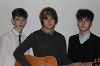
2. This image shows the band members looking rather serious which can often try and suggest that they are important, moody and to be taken seriously. This type of photograph of bands is fairly common, with the suggestion of sulky and sullen band members, which is often linked with unpredictable and intense performances.

Photographs for Double-Page Spread 3 of 3

6.7.


8.9. 

From researching I undertook the appropriate representations of the women and men in the magazines which they typically look angelic and less 'rock and roll' .They mainly are photographed with a guitar by them leaning on the ground or they are holding the guitar. However as you can see on these photographs I wanted to elaborate the 'rock and roll' sense by throwing the guitar which could be associated with the rock or punk genres and I could include this for the folk rock element in my magazine. I wanted to change the norm and stereotype for acoustic artists and add in an air of rebellion which I think could work well and its something unique which will stand out to people.

These photos would be very useful as they could be used as a double-page spread effectively as the text could all go to the left side surrounding the person. I could edit the images and combine them all together overlapping each other and lowering there opacity so it shows the process of him throwing the guitar which I think would look new and creative.

Photographs for Double-Page Spread 2 of 3

3.4.

5.

4. This image is quite the opposite of the vibes I want my magazine to give off. This image is quite scary and intimidating because of the fierce and evil emotions he is giving and showing his guitar up like he is threatening with it. I will clearly not be using this image but I wanted to include it to demonstrate of the image I don't want to be in my magazine.

5. I love this image as it looks like he is having an extreme amount of fun which is in fact what I want my magazine to include - unlike image 5 on this post. It looks like he is mid playing the guitar so it looks like a natural image and it would fit well as the text could all go to the left of him and surrounding him like in other double-page spreads. In all I really like this image and may use it.

3. This image isn't that interesting and exciting as it doesn't show the persons face and he is holding the guitar quite strangely on the floor which does not look natural like image 6 so I don't think I will use this image because it doesn't stand out and there is not anything special about it.

Photographs for Double-Page Spread 1 of 3

1.2.
1. I love this image as it shows great excitement in what he loves playing - the guitar. He is also doing the rock and roll peace sign which can fit the area of acoustic rock in my magazine. Again like in my other images if your artist is looking directly at the camera it is very hard for the audience not to look at them back therefore its engaging if your artist is using direct address. It makes you have a very strong and confronting post which makes the shot quite powerful and you aware of it almost immediately.

2. This image shows the artist engrossed in playing his guitar, he is looking intensely at his fingers playing different chords. I particular like the way the artist has one foot against the wall which would suggest confidence and a slightly rock and roll attitude with the folk rock genre being influenced. Also unlike image 1, this image has the whole of the guitar in shot which is important as he is actually playing the guitar unlike the previous image.